When was the last time you subscribed to an online magazine though you were not planning to do so?
Yes, it happens to most of us. The reason behind it is the original content and the Call to Action buttons that compel us to move to the next level with our search.
Table of Contents
What’s a Call To Action (CTA)?
A call to action button is an interactive button on websites for users. The primary purpose of putting CTAs on the website is to help the user, improve communication and increase conversion. It is a vital part of marketing.
However, have you ever noticed the way websites place these buttons?
When placing a CTA or Call to Action button on your website, factors such as color, text, website design, and space are essential.
Another addition to this list is the placement of the CTA buttons on the web pages. How and where to place the CTA to help improve your website and land more traffic requires logic, planning, and strategy.
The placing should be specific to the website and strategic to generate a response. The placement should be so prominent that the reader must click the button before moving.
Most companies display a CTA button on the top page, which is a good strategy for conversion. Some websites provide a clear Call to Action button on their full page of the websites.
For instance, Milanote, a project organizing platform, displays its CTA button right on the top page. It shows clear communication to join the forum for free, and two CTAs are given on the top left for members who have already signed up.
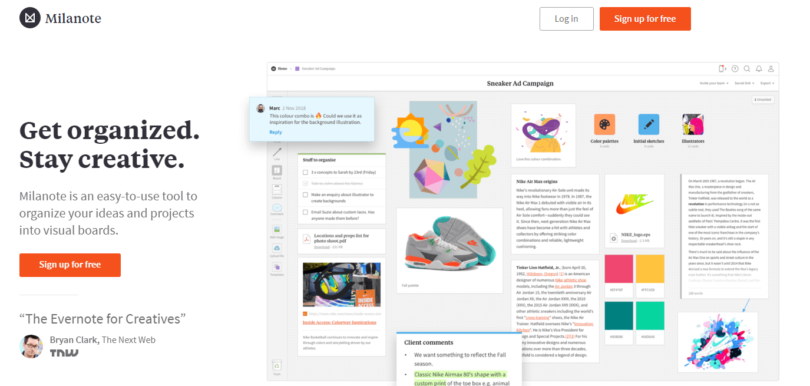
The central positioning of the CTAs is observed on the top pages. Mostly it depends on the kind of content you show up on the website. The placement of CTA will be according to it.
In many cases, the audience does not require in-depth information on the first page of the website. Then, you might provide fresh content to describe your service, then a CTA at the top page is best to get conversions.
CTA Buttons that need not be on Top Page
If the content you provide is complex and needs an explanation, placing the CTA buttons after completing the necessary communication is better.
As CTA must be the next step for the user, getting complete information is vital. Moreover, users scroll through the pages on mobile-friendly websites and then click the CTA buttons.
The second best spot to place CTA buttons is in the page’s footer. Some marketers say that that’s even better for conversion as the visitor already knows what the website or the offer is about, so when they click or tap on the CTA, they know what they want and what they should expect.
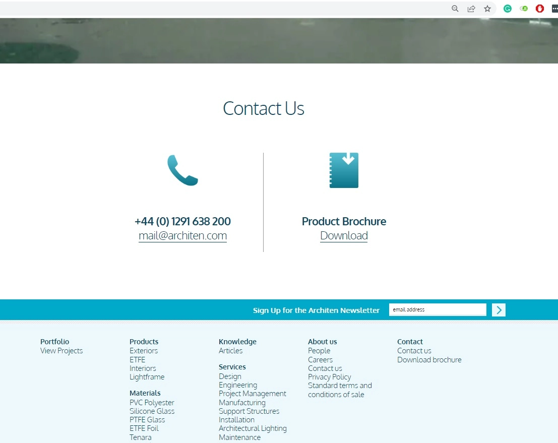
Architen Landrell, a company at the forefront of tensile architecture innovation, specializes in structural membrane design to create landmark tensile fabric structures and iconic features.
They display the CTA buttons in the footer of all their pages. It shows clear communication to contact them by email or phone OR download their brochure if you want to find out more before getting in touch with the company.
Where CTA is your Next Step
Many websites have interactive content where steps must be followed to complete the interaction—for instance, e-commerce websites like Amazon, eBay, and Flipkart. Submit buttons are necessary CTA buttons when filling out a form or making payments.
Here at Monetize.info, we have a CTA on the homepage in the header inviting visitors to signup for our newsletter and become a member of our community:
In the case of blogs or lengthy texts shared on the website, people do not display the whole chunk in one go. So, the Read More or Know More buttons at the end of the text guide the reader to the next page. Moreover, it helps to raise curiosity and interest in the article.
Also, the home page remains free of clutter and drives traffic to the blog page—for instance, the homepage of Philips India.

Avoid CTA Overloading
It is essential to get conversions; thus, you might end up giving a bag full of CTAs on your website. Too many CTAs on one page can create clutter and confuse the audience. It might affect the decision-making process of the audience.
Here at Monetize.info, we did a test with CTA overloading to see how users will interact with multiple CTAs. The results were precise. They had four many options instead of a clear one made people leave the website without taking action.

Secondary CTAs should be placed, so they do not overpower your primary CTAs.
CTAs in Empty White Spaces
If you want a high-converting CTA button on your website, you can use the white spaces to put CTA buttons strategically. Spaces between paragraphs, columns, and images are known as white spaces.
The website designers use these spaces in a way that impacts the reader’s mind. For instance, look at the CTA button on the Coca-Cola website.
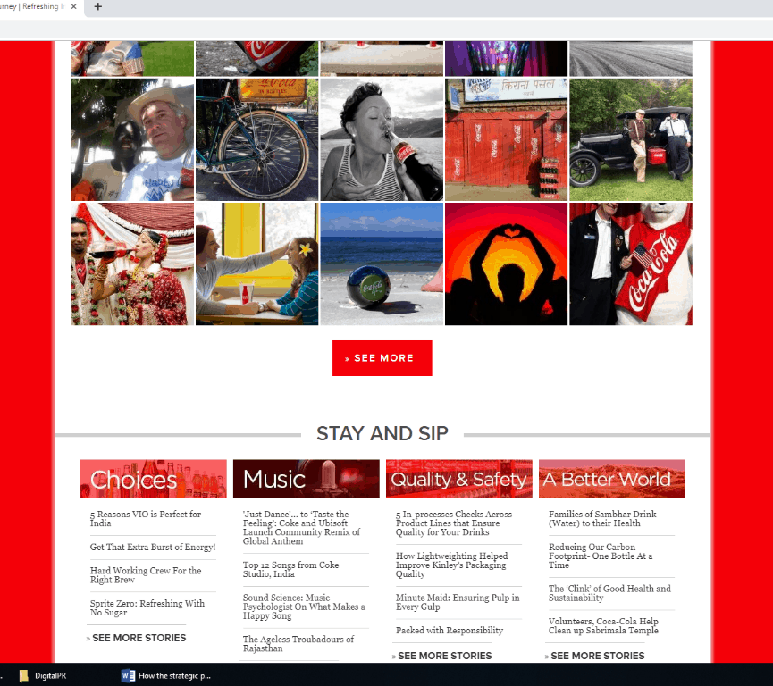
CTAs in white spaces catch the reader’s attention quickly, especially in the case of mobile phones. These spaces are also known as negative spaces.
Conclusion
It is true if your content is not attractive enough to catch the reader’s attention, then the CTA buttons also are of no use. Every CTA is interconnected with the content.
Readability is a significant factor that helps in getting conversion through CTA. Thus, the next time you design the website, remember where to place the CTA buttons.
 Monetize.info We Help You Monetize Better Your Digital Assets! 💰👍


