
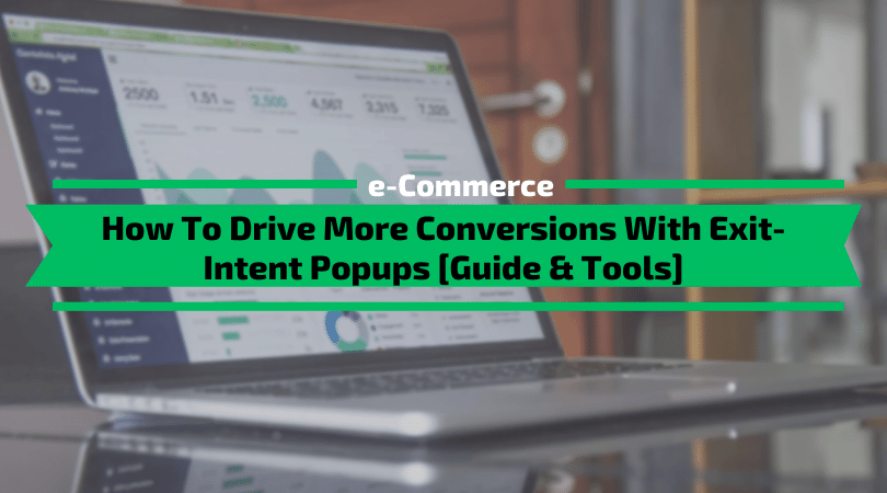
Love them or hate them, exit-intent pop-ups are here to stay. When designed and implemented correctly, popups are a handy tool for extracting value from each visit. In this article, I’m going to show you how to dramatically drive more conversions with exit-intent popups.
This is especially true in eCommerce, where many online retailers pursue market growth through paid channels like Google Ads and Facebook Ads. It’s more important than ever to make every interaction count.
But with the widespread adoption of exit-intent popups, their impact is beginning to diminish.
To stand out from the crowd, you must consider some important rules when designing exit-intent popups – rules that will help you leverage this conversion optimization tool to its full potential.Table of Contents
1. Make your Exit Popups unique
Popups are everywhere. That’s because they can be an effective means of keeping visitors engaged, even as they demonstrate bounce-like behaviour.
However, their very popularity means that retailers need to work harder to distinguish themselves from the pack. This starts with the design of the popup itself.
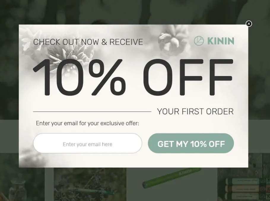
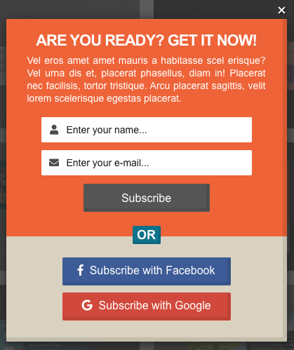
In the below example, the offer itself is compelling. However, this popup’s effectiveness is compromised by the design of the box, which, together with some low-rent branding, makes the popup complicated to signup.
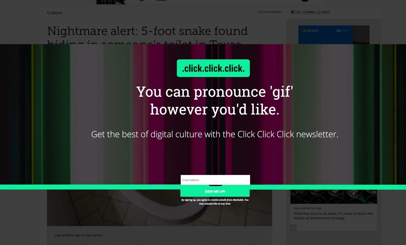
Source: HelloBar
1.1 What’s so bad about it?
If you peer into the background behind the popup, you’ll see a news story headline that begins with “Nightmare Alert”. I think that’s a pretty accurate description of what’s happening here.
- Design: Bad. The first thing I saw looks like a big mistake. The green line with the button hanging off the bottom looks like the designer fell asleep with their head on the mouse.
- Clarity: Bad. And what on earth does the headline mean? click.click.click. Upon deeper exploration, it’s the newsletter’s name, but that’s not apparent at all on the first load.
- Clarity: worse. Then we get the classic “Clear vs Clever” headline treatment. Why are you talking about the pronunciation of the word “Gif”? Tell me what this is, and why I should care to give you my email.
- Design: Bad. Also, that background is gnarly.
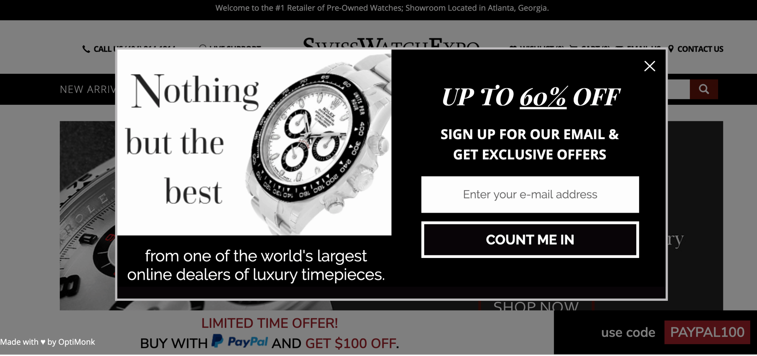
Popups need to look like they belong on the page; they need to fit in with the website’s overall branding. An inconsistent design can make visitors think that your popup is spam, rather than something that could provide value. Matching the branding with the colour scheme and font of the website creates a seamless experience while staying unique in a world full of ‘me-too’ popup designs.
The below popup from SwissWatchExpo is a great example of consistent design in action, with a colour scheme and overall branding firmly in sync with its website.
2. CTA Is Relevant, Concise, and Instantly Redeemable?
Less is more when it comes to the design of your CTA (call-to-action). Two key reasons why visitors often skip popups is because the CTA lacks concise relevance (i.e. perceived value), or doesn’t provide any instant gratification.
In the case of exit popups, the user has already decided that the landing page lacks relevancy, either through brand or product-specific cues.
Therefore, the exit popup is your last shot of demonstrating meaningful relevancy and should be short, concise, and instantly redeemable.
In other words, it should answer questions relating to the ‘what’ (is the offer?), the ‘why’ (is this valuable?), and the ‘when’ (can I get it now?).
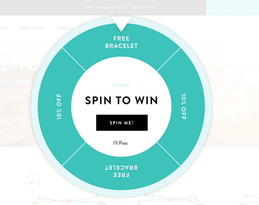
This next popup from Pura Vida Bracelets is a perfect example of a compelling CTA. Here, not only is the offer concise and visually appealing, but the ‘Get Free Bracelet’ button conveys how the request will be fulfilled. The text beneath it provides further reinforcement of instant gratification.
3. Always Follow The ‘F-Shape’ Rule
The ‘F-shaped’ rule is a well-established rule of thumb in the conversion rate optimization world. It assumes that when visitors first encounter a new website, they study the landing page in an ‘F-shaped’ pattern.
When designing an exit popup (or any popup, for that matter), you should adopt a similar approach – place your key messaging in an F-shape. This is especially true if your popup is larger than three-quarters of the overall screen size.
In the example below, the popup’s left side is prime screen real estate, as this where the user’s eye line will naturally gravitate to.
As such, the left side is where you should place the key textual elements of your CTA, reserving the right side for your main imagery. This will draw more attention to your key message, thereby increasing the possibility of keeping prospective customers engaged.
4. Don’t Make All Your Exit Popups The Same
A common mistake among retailers is to employ the same exit popup for every page. This fundamentally ignores the context of the ‘exit’ action (the specific reason people choose to exit a given page).
Understanding this context presents a significant opportunity to tailor your popups with personalized offers.
For example, cart abandonment is a major issue for growing and established retailers alike. The shipping cost is commonly seen as a key trigger of cart abandonment, or perhaps more specifically, the added cost to the order is only disclosed immediately before checkout.
This can be a major issue for customers who may feel that the shipping charge is excessive, and therefore look to shop around for a better deal. In this case, your ‘standard’ exit popup is unlikely to be effective in persuading the user to continue to checkout, unless it offers some form of transactional discount.
And if you’ve spent a lot of time, money or effort in attracting customers to your site, only to see them fall at the final hurdle, you might want to consider triggering a customised popup where the CTA offers free shipping (or some form of shipping discount) to win the initial sale.
Yes, you’re sacrificing margin, but this one trick can work wonders for your overall conversion rate!
5. Don’t Convey a False Sense of Urgency
Conveying some sense of urgency through a limited time offer is an oft-used tactic amongst sophisticated retailers. However, doing this right does not look like this:
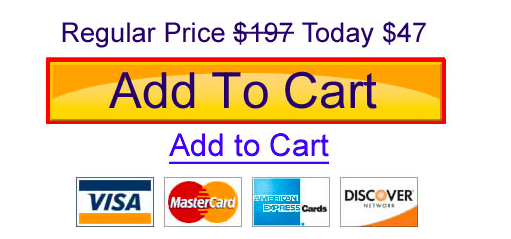
Your customers are smart. Reducing your price in such an overly-dramatic manner (and just as your prospective customers are heading for the exit door) can also quickly diminish the perceived value of your product and your credibility.
In other words, this may prompt the user to think ‘is this actually a one-time-only deal or can I come back some other time and see the same popup?’.
The issue here isn’t the price reduction. Instead, the mistake lies in how this price reduction is communicated.
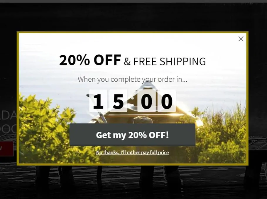
A better way to execute this tactic is to follow the below example, and add a time-specific countdown to claim the offer.
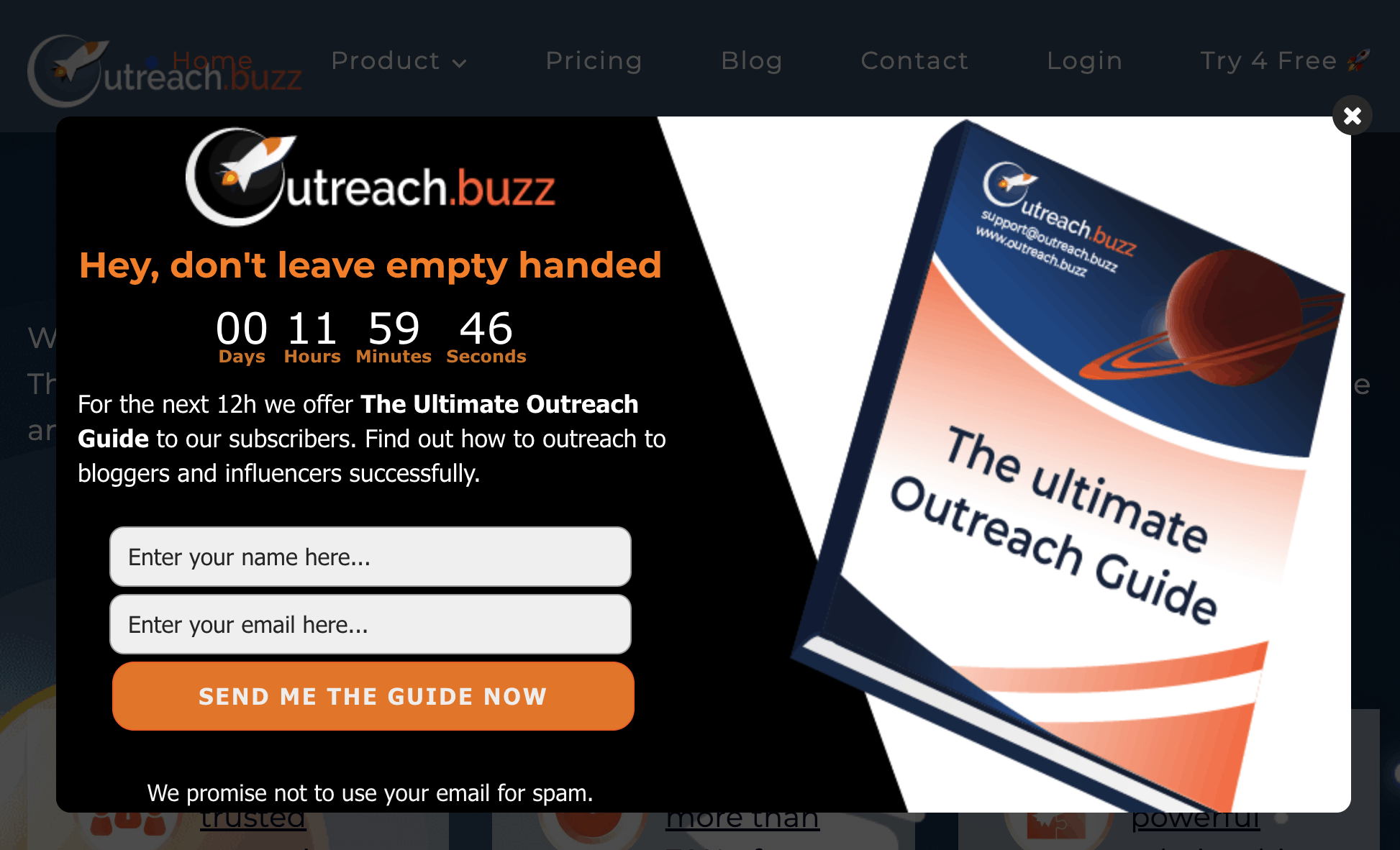
This popup doesn’t fake urgency. Instead, it gives the user a personalized and time-sensitive offer.
So how do you get started?
6. Popup Tools to get started
The great news is that there are lots of tools out there to transform your popups’ effectiveness.
Here are just a few to get you started:
6.1 OptinMonster [20% Off Deal] [SaaS]
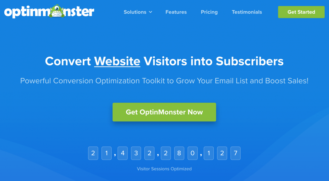
When I am asked about the best solution to grab email leeads or increase pop-ul conversion rate I answer by saying, without doubt, OptinMonster. That’s because I’m using it here at Monetize.info for over 3 years and never been more happy with the results.
OptinMonster is possibly the most feature-rich popup tool at its price point. Their signature exit-intent technology promises to convert an additional 2-4% of visitors.
6.2 ConvertPro [10% Off Deal] [WP Plugin]
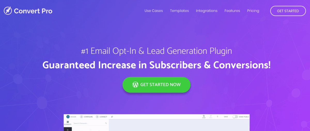
Convert Pro is an effective WordPress popup plugin that can be used by everyone that wishes to increase conversions on their websites. It is made with non-techies and normal WordPress users in mind being one of the best plugins that will help you build email lists with exit-intent technology. There are 62 templates you can choose from or design one as you wish using the visual editor that comes with this plugin.
6.3 Picreel [SaaS]
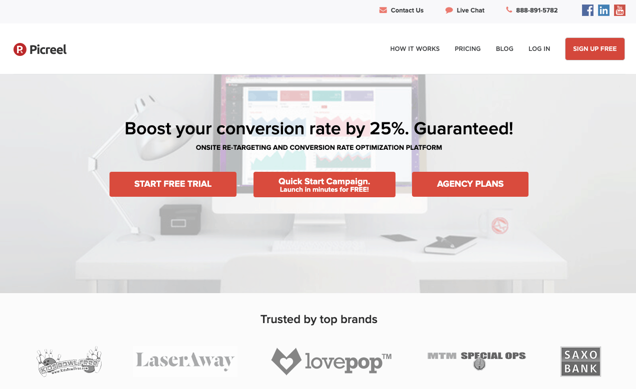
Picreel optimizes offers on your website by tracking visitors’ digital footprint and click behaviour in real-time and then serves up the most relevant offer as they navigate around your valuable content Picreel is easy to integrate and has a powerful A / B testing feature, which allows retailers to test the performance of different buttons, styles, colours, and texts.
6.4 WisePops [SaaS]
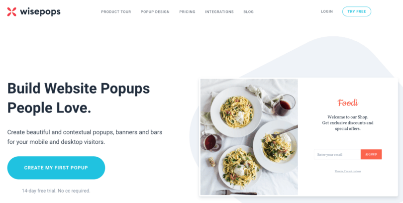
WisePops enables you to create awesome-looking popups in minutes easily. They provide a robust solution to design, targeting, and analytics. Better still, they offer a free 14-day trial.
6.5 OptiMonk [SaaS]
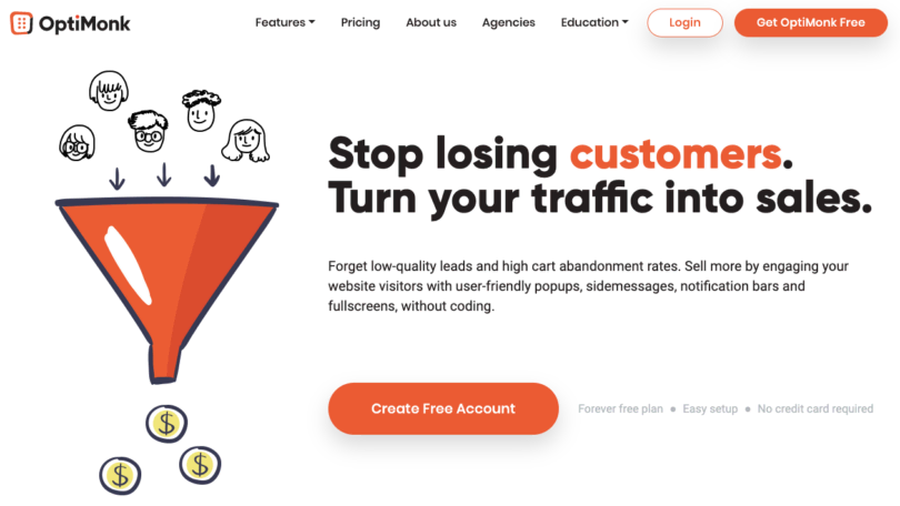
These guys specialize in exit popups. Easy to use, yet feature-rich, it’s definitely one of the better popup tools on the market.
6.6 Layered Popups [WPPlugin] [$21]
Layered Popups is a WordPress plugin that takes care of all your popup needs. It integrates well with 90 email marketing systems (the list is really impressive) and supports all kind of popups and actions (Onload, onExit, onScroll, OnIdle, OnClick, Inline Form, Sidebar Widget, Non-WP Pages, Link Locker, AdBlock Detector, Content Start, Content End)
Besides that, have over 100 popup designs that can be easily changed and customized according to your needs. We use Layered Popups here on Monetize.info. One feature that I couldn’t find in other popup solutions is that visitors can sign up with their Google or Facebook account without entering their email address and name.
7. Conclusion
If you’re a frequent reader of Monetize.info, you know that I always aim for conversions. (encourage the visitor purchase, leave their email address, subscribe to notifications, share on social media, etc.).
Exit popups are great for this, and I’m an advocate of using them. But enough about me. You know now why you should use them and what tools help you.
What about you? What are your results with exit-intent popups?


Stephan,
Great pitch. Above all, your sample images are inspiring. ‘Don’t go empty handed’ – sure this will compel user to take action before closing the exit pop-up. ‘F-shaped’ analogy will work well as you explained. The content & CTA decides the conversion rates again.
Great Info!! Finally I got a helpful article. Thanks for sharing..
Thanks for the article, it was interesting. But I think that pop-ups dont work anymore. They arent customised to the needs of smartphone users like me.
Approximately one-third of visitors to websites check their sites via mobile devices. If you do not adapt the banner for gadgets, then it will ugly stretch the screen or display incorrectly at all. It is imperative to check the pop-up functionality in both browser and mobile versions of the site. But unfortunately, usually, very little time is spent on the mobile version of the site.
Glad that you like it and find the article useful. I put some work into make it and to make sure it delivers value for the readers that want to improve pop-ups conversions.
I agree with you..mobile changed the game but there are responsive pop-ups as well. I use them here at Monetize.info and get good conversions. As long as the website owner provides value the visitors will leave their email address to get the gift.
Thank you very much for this blog. Can I use html tags here to pingback my own blog?