

According to a survey conducted by Statista, retail e-commerce worldwide sales in 2017 was 2.3 trillion US dollars, and it is expected that this figure will reach 4.88 trillion US dollars in 2021.
According to another research conducted by Statista, the U.S. customer satisfaction index in 2017 was 74.3 index points.
According to a study carried out by Statista, the online shopping cart abandonment rate worldwide in 2017 was 69.23%.
Now, if you sum up all the above statistics, then you can conclude the following things:
- E-commerce sales are increasing day-by-day & it will keep on rising every year.
- Despite so much awareness about the e-commerce business, the customer satisfaction rate is average, and at the same time, the cart abandonment rate is very high.
From this analysis, you can be sure that there is something not right in the way e-commerce websites are being set up. Now, the most important page in any e-commerce website is the product page. The reason for that is, it is the one which attracts the visitors & brings the business.
Therefore, you should be very careful while designing the product page for your e-commerce website.
Today, we’re going to provide you with a checklist that will help you design the e-commerce product page effectively.
So, fasten your seatbelts and get ready to ride on a rollercoaster where you will get to touch upon various aspects of the product page design.
Table of Contents
1. Amazing Product Images
As there is a famous saying:
“A picture is worth a thousand words.”
The same applies to the case of an e-commerce product page, where product images matter a lot. Selling to your customers is all about presentation. Attractive product images make your product look better and more desirable.
According to a survey conducted by PoweredBySearch, 92.6% of the consumers say that visuals are the top influential factor that affects the purchasing decision. So, it is obvious that the quality of your product images directly affects your sales.
Therefore, having an amazing product image on your website should be your topmost priority.
Below are some of the golden rules for designing amazing product images:
Rule-1: Always Prefer High-Quality & Custom Images
You should always use high-quality images that are not too funny, neither too small. If possible, always opt for custom images to reflect your brand and stand out from the rest. In addition to that, each of your images should be of the same size and style.

Rule-2: 360 Degree Views or Views From All Angels
Missing information and uncertainty is one of the primary reasons people don’t buy a product from a particular e-commerce site. For that matter, you can provide 360 views of your product, which solves your customers’ doubts.

As shown in the figure, Nike gives its customers every possible view of the shoes, which takes away the uncertainty factor.
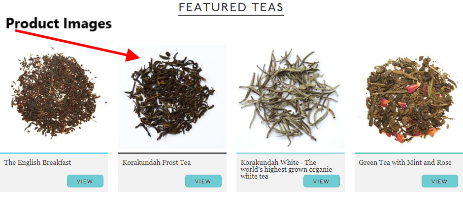
Rule-3: Product Variation Images
58% – Increase in sales when there are multiple product views.
From these statistics, you can learn that the more product variation images (in terms of color, size, etc.) present on your site, the more chances of increasing the sales.
If a buyer is looking to buy a product on your website and he/she can’t find any product variation images on your site, then he/she will feel frustrated by it and leave your site.
Therefore, you should make sure that different product images are present on your website, as it will help the customers.
Amazon does this thing beautifully. As you can see from the figure, there is an image of different sizes and colors. So, the customer will get an exact idea of what he/she will receive after the purchase.
Rule-4: Detailed Views
According to a survey by Forrester & UPS, 55% of the people don’t buy online as they prefer to examine the item in person.
To solve that issue, what you can do is provide a detailed & zoomable image, which is the next best thing after the physical touch & feel.
Your product images should be such that the shoppers don’t need to go to a store and look for the actual product in person.
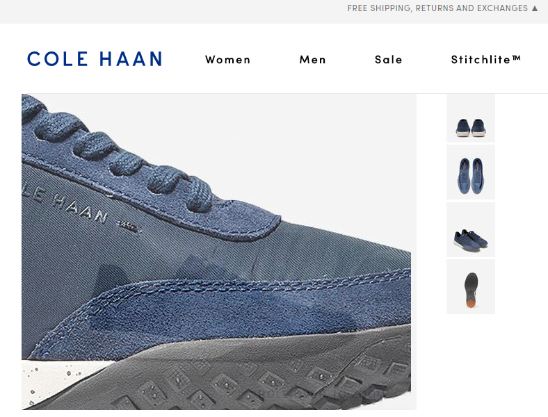
COLE HAAN does a great job of providing a detailed and zoomable view of their products, which helps them increase sales for their e-commerce site.
Rule-5: Images With Context
“Will this dress look good on me?”
“Maybe, this looks on a 6’ model, but will it suit a 5’4” height women?”
These are some of the questions which Images With Context can answer. When you show your customers how your products can be used in real-time, it helps them immensely.


As you can see in the pictures, Handcraft display Images With Context in a beautiful manner. To show how Overhead Hold Bag works in a real-time scenario, they have displayed two images with a man using the bag at different places. It will help your shoppers.
2. Helpful & Interesting Product Description
The product description is the second most important thing on your product page after product images. It helps your customer know about your products in detail, which eventually helps them decide. Therefore, you should give prime importance to this aspect.
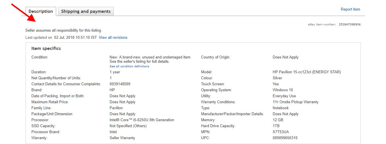
eBay, which is one most popular e-commerce websites, does this thing wonderfully well. As you can see in the screenshot, they’ve provided a detailed description of the HP Pavillion laptop. So, after reading this description, all the doubts of the customer will vanish.
What Makes A Good Product Description?
- Try to be helpful, Not “Salesy”: You should always write a product description that helps customers understand the product better. Make sure you never over-promise. Otherwise, there will be a chance of negative reviews.
- Only include information that shoppers care about: When you’re writing the description of your product, you should never write the technical specification that you get from the manufacturer. Write in a way that your shoppers could understand.
- For example: If you’re selling an iPhone, then 16GB or 32 GB will tell the customer about the storage space, but it doesn’t tell them how much storage is enough for them. Instead of that, you can write like 16 GB iPhone can store up to 3,000 songs or 250 apps and 32 GB iPhone can store up to 7,00 songs or 400 apps.
- Please provide a short & long version of your description: Most people scan the product description rather than reading it, and therefore, you must create a short and long version of your description. So, the people who want to scan can read the short version, and the one who wants in-depth knowledge can read the longer version.
How To Write A Good Product Description?
- Avoid Long Sentences
- Avoid Cliches
- Avoid Complex Vocabulary
3. Product Demo Videos
Product Images are excellent, but the Product Videos are even better.!
31% – consumers bought products after being convinced by the product videos.
Therefore, it becomes essential for you to have a good product demo video on your e-commerce product page. A good product video not only provides a touch of personalization to your shoppers but also becomes your primary source of traffic generation through YouTube.
Just by looking at the product video, a person can feel how the product is in real-time, which is the next best thing after visiting a store & talking to a salesperson.
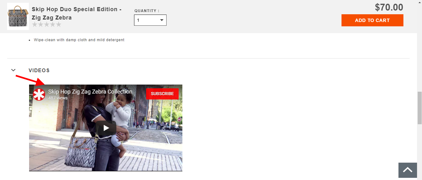
Show the screenshot. Skiphop does very well at displaying the demo videos of any product on their product page. For the moms who are wondering how they can use the Zig Zag Zebra bag effectively, this video can be of real help.
4. Clear Placement Of Price
Price is the most important for any of your shoppers, and therefore, you need to display it prominently. If your shoppers can’t find the price tag on your product page, then he/she will surely get frustrated by that and will leave your site.
How To Display Your Price Clearly On Product Page?
- Use a large font-size: You should display the price with the largest font size on the product page.
- Use contrasting tone: Always use a color for the price, which makes it stand out from the rest of the product page.
- Place it near the Buy Button or Title: Placement of the price is also the key to your successful product page, and therefore, you should place your price near the buy button or title. The reason for that is, they are the ones who grab a lot of attention from the people.
Real-Time Example Of Good Price Placement
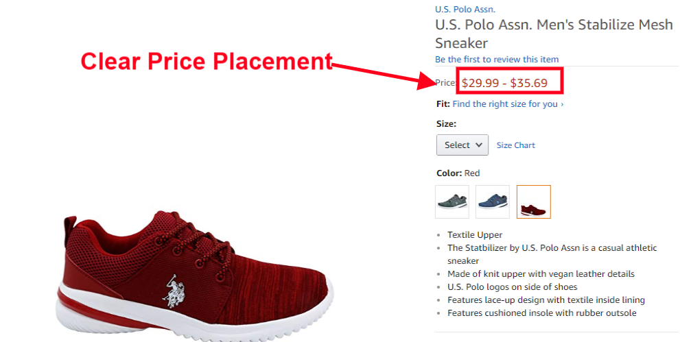
Amazon, one of the leaders of the e-commerce business, does this thing well. They have displayed the price in a different color from the rest of the product page. They have also placed the price just below the title, which grabs a lot of attention.
The product page’s primary goal is to make your customer click on the “Add-To-Cart” button, as it will bring the business to your website. Therefore, your “Add-To-Cart” button should be the most dominating element on your product page.
A great “Add-To-Cart” button helps your customers know the next step if they want to purchase any product and give them the right direction.
What Should Be Your Ideal Add-To-Cart Button?
- It should have a contrasting color: Studies have shown that the orange and green color button gets the maximum clicks. However, it all depends on your product page design, but you should choose such a color that stands out from the rest of the page.
- Use a sizable button & text: Make sure that your button is large enough but not too large. Your visitors should be able to find the “Add-To-Cart” button within 3 seconds.
Real-Time Example Of Good Add-To-Cart Button
Nike.com, a trendy sports brand, does an excellent job of displaying an excellent Add-To-Cart button. They have chosen the green color for the button, which makes it stand out from the rest.
6. Displaying Customer Reviews & Ratings
According to research, 85% of the customers read online reviews and ratings before purchasing decisions. Therefore, you should start collecting reviews from your customers on your product page.
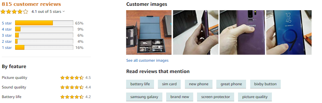
Most of the companies don’t like to display reviews on their product page, as they fear that one bad review may affect the company’s impression.
As there is a famous saying by great Sachin Tendulkar that:
“When people throw stones at you, turn them into milestones.”
The same applies to negative reviews, where if you can handle them with care, that could help you establish trust among your customers. It would help if you always answered your negative reviews with professionalism and courtesy. Always try to think from the customer’s perspective and provide them with a good solution.
7. Address Uncertainties
- “Is this website safe?”
- “How long will it take to get my stuff?”
- “What is the product return policy?”
These are some of the questions that shoppers have in mind when they’re thinking of purchasing a product from your site. Therefore, you need to address all these uncertainties and take away the fear factor from your customers. Once you do that, then people will purchase from your store.
Following are some of the most common uncertainties and ways to address them:
- Security Concerns: To address this issue, you should add trustworthy credit card logos on your product pages.
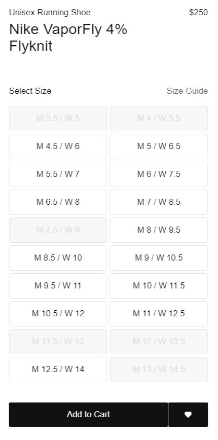
- Fit Issue: Add a sizing chart next to the size options.
- Shipping Cost Issue: Add your shipping policy near the product description. Having a custom shipping method could work very well.
- Return Concerns: Add your return policy near the product description.
The bottom line is that you should provide answers to your customers’ concerns, as it will create an opportunity for you to increase your business.
Are you someone who regularly does online shopping? Then, you may have seen the recommended products on the product page. Related and recommended products are the best way to cross-sell to a customer.
For those who don’t know, Cross-Selling means you’re offering similar products that the shoppers might like as well. For example: If someone is looking to buy a Punjabi Recipe book, you can also provide them a Dessert Recipe book.
Amazon is someone who masters in cross-selling. They seem to have an uncanny way of predicting what each customer will like, and based on that, they place a recommendation for each person. By implementing this concept, they have been able to grow their business.
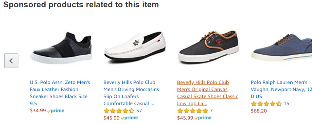
As shown in the screenshot above, Amazon will offer me plenty of other cricket bats as a recommendation when I’m looking to buy an MRF cricket bat. It is known as cross-selling.
There are two significant things that you should remember while implementing Cross-Selling:
- Offer your shoppers more products that they might love.
- Offer them a similar but different selection if the products they’re looking for is not right.
Conclusion
Designing the right product page is critical to the success of your e-commerce business. There are so many factors that affect the product page’s design, and remembering them would be quite a task for any business owner.
Are you involved in CPA Marketing for e-commerce or any other marketing form? You should take extra measures to make sure your product page is awesome as the conversion rate is really influenced by it.
If you ask any WooCommerce Development Company about the most critical part of E-Commerce website development, they will surely tell you to focus on product page design. Check our top of WordPress development companies and hire the best company for you to upgrade your online shop.
In this blog post, we have provided the checklist for designing an excellent e-commerce product page, which will make your job much more comfortable.
What are your thoughts on this article? Is there any suggestion that you want to give us or any questions you may want to ask? Then, please leave your thoughts in our comment section.
We will try to answer each of your queries to the best of our abilities. Thank you.!
![How to build backlinks for eCommerce [The Ultimate Guide]](https://monetize.info/wp-content/uploads/2020/07/How-to-build-backlinks-for-eCommerce-The-Ultimate-Guide-310x165.webp)


I love your post! Very useful tips on how to have a converting product page. To be fair I am concerned about my conversion rate. Especialy now, when it’s a second wave of lockdowns. I will send this article to my developers https://itmaster-soft.com/ and discuss what we can do right now to update my site. Thank you for your help!
@Henry I’m glad you found our article useful. That’s right, with the second wave of lockdowns and the economic issues the world has, selling will be harder to do so you need to make sure that you get better conversion rates.
A good research! I love your posts!
I like how the writer organized his thoughts in addition to he visual part.