We have all heard the statistics; more than 70% of your customers are abandoning your shopping cart without actually making a purchase.
To put that in perspective, out of every 100 people who reach your checkout page, a little more than 30 actually make a purchase. The remaining 70? Poof! They’re gone!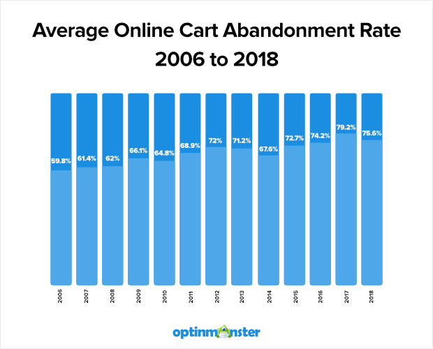
This is a fact and not industry-specific. Shopping cart abandonment rates have been consistent across all eCommerce industries for the last 5 years. Business Insider reports that approximately $4 trillion worth of products will be abandoned in online shopping carts this year. And 63% of that is actually recoverable!
But what can we do about it?
We’ve got products to stock, orders to fulfill, and emails to send. Who has the time to spend countless hours wading through analytics to discover our shopping cart abandonment problem?
To simplify things for you, we’ve created a simple 5 step process to track your cart abandonment. You can implement this in 5 minutes and start collecting data about what’s causing customers to abandon your cart.Then, when you’ve identified the issue, you can A/B test a few changes to find the best solution.
Table of Contents
#1. Why Customers Abandon Carts?
Before we try to fix the problem, we first need to understand the reasons behind cart abandonment.
Statista conducted a survey of online shoppers to figure out what made them drop out of the checkout. The results are shown below:
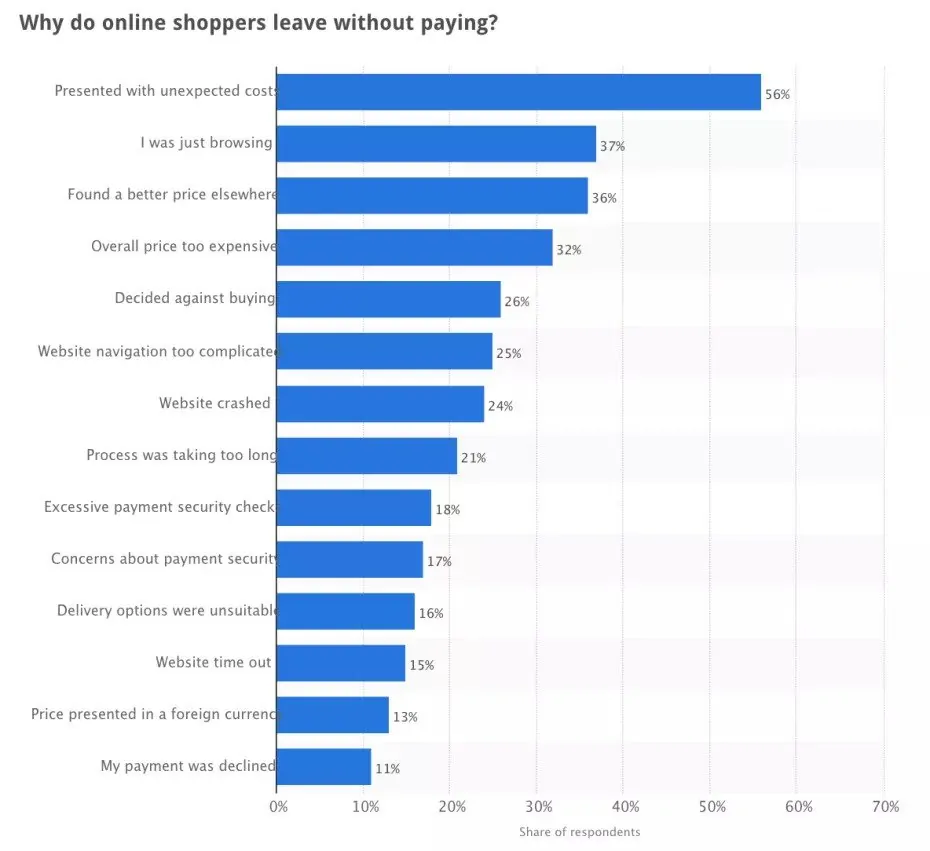
It’s likely that customers are abandoning your cart for one or a combination of the above reasons. There could also be other reasons specific to your store.
Instead of guessing at what the reason could be, let’s pinpoint the issue with Google Analytics. By tracking your checkout funnel, we can find out at what stage your shoppers are abandoning you and see if it corresponds with one of the above reasons.
After you identify the issue, you can test a bunch of solutions and create the conversion machine your eCommerce store is supposed to be.
#2. How to Set Up A Funnel In Google Analytics
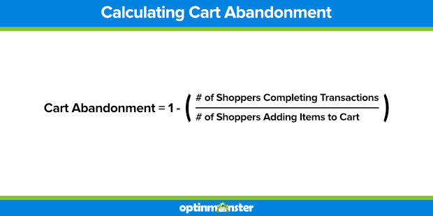
To start with, let’s calculate your current cart abandonment rate. If you haven’t set up your analytics already you can calculate it manually. You might want to sit down for this!
Use the formula:
Cart Abandonment Rate = 1 – (number of orders placed/number of shopping carts created)
But you work hard enough already, so let Google Analytics do the grunt work for you. You’ll need to integrate your eCommerce store with Google Analytics first.
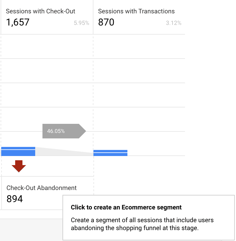
If you set up enhanced eCommerce Tracking to start tracking your Cart Abandonment all you need to do is navigate to Conversions -> Shopping Behavior
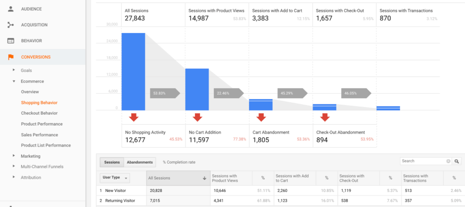
This rad new report is super powerful and you can even create custom segments to retarget to.
Each one of these segments can be marketed to differently. For example, if someone doesn’t view a product you can send them ads showing them what life would be like with your product.
For those who abandoned the process at checkout, you can test out a win-back campaign with different offers. Test giving $5.00 or 10% OFF as an incentive for them to complete their checkout now.
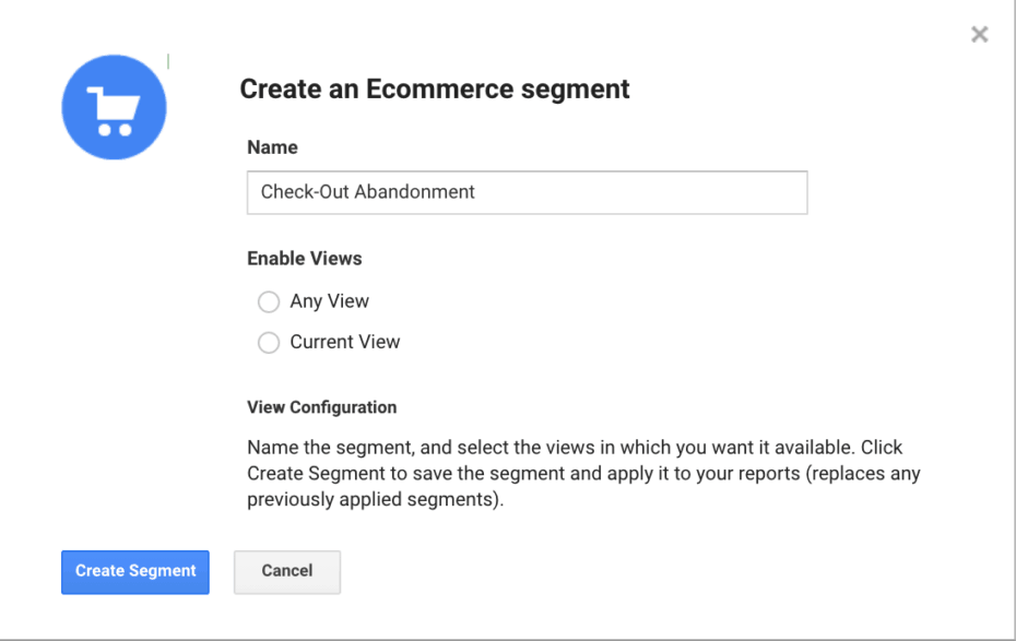
Though this is tracking automatically in Google Analytics you can always track shopping cart abandonment the old school way. We’ve outlined the steps to do this in detail below.
Step 1: Create a Goal
From your Google Analytics Admin panel, head to the Goals section under the third column ‘View’. Be sure to select the right account and property. If you have multiple accounts or properties, you can identify the right for your store with the unique Google Analytics tracking code.
On clicking through, you’ll be taken to the ‘Goal’ page where you can create a new goal.
Step 2: Goal Setup
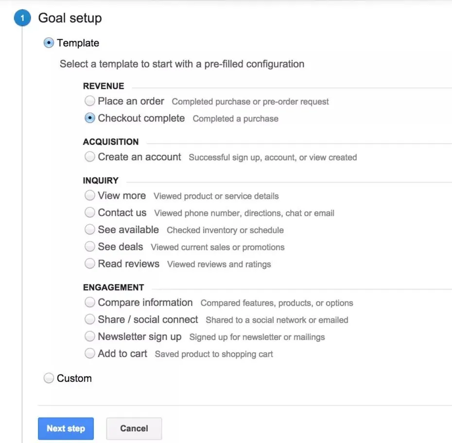
Click the red ‘Create Goal’ button to create a new one. To start with, you need to select a template that defines what kind of goal you want to track. For cart abandonment, you want to select the ‘Checkout complete’ under the ‘Revenue’ section.
Step 3: Describe The Goal
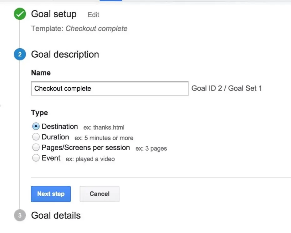
Now, you need to describe your goal and define the type of event you want to track. Give it a descriptive name to help you identify the goal in your reports. Then, choose the destination option because you want to track if customers reach your success or thank you page.
Step 4: Define The Success URL
For Google Analytics to track if a customer has made a purchase it needs to know what the success page is. This is typically the page a customer sees after making a purchase. When customers land on this page, it implies that they’ve made a purchase, otherwise, they wouldn’t be seeing the page.
If you don’t know what your success URL is, you might have to make a dummy purchase and copy the URL into Google Analytics. Typically, they are static URLs like the one in the image, so you can select the ‘Equals to’ option.
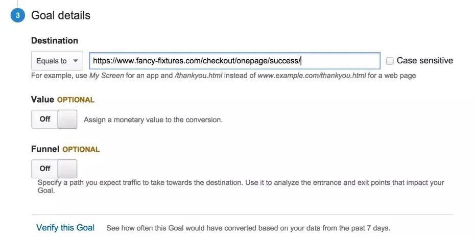
If your success URL isn’t static, and some eCommerce platforms generate dynamic URLs, you’ll have to choose the ‘Begins with’ option and enter the first part of the URL. For example, you might find that the URL is www.storename.com/checkout/success/4556958609. That number at the end will change for each new customer, so enter only the static part that comes before it.
Step 5: Create The Funnel
The funnel will help you identify the path that customers take to conversion. To create yours, you’ll need to toggle it to ‘On’.
What you want to do is enter every URL that the customer passes through before reaching the destination URL (which is the success page). Again, you might have to do a dummy purchase and capture every URL so that you don’t make a mistake.
In this case there are 2 pages prior to checkout, the cart page and checkout page. However, it differs with each store and I’ve seen as many as 7 steps in a checkout process.
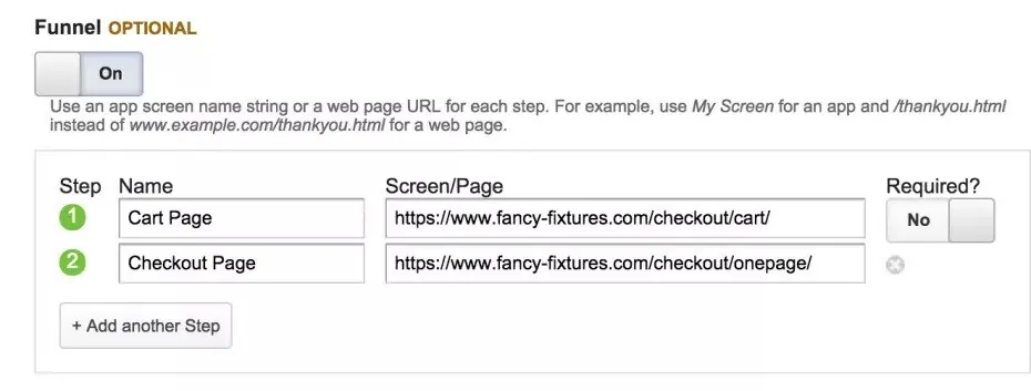
After you’re done creating the funnel, save the goal. Google Analytics will now start tracking it and you can see the results in your reports.
#3. How to view Funnel Reports
Depending on your sales volume you might have to check your goal data and funnel statistics in a few days or weeks. This will give you enough time to figure out where customers are dropping out of your funnel.
In the Reporting tab, go to the Conversions section and look at the Funnel visualization for your Goal. Be sure to select which goal you’re looking at from the drop down.
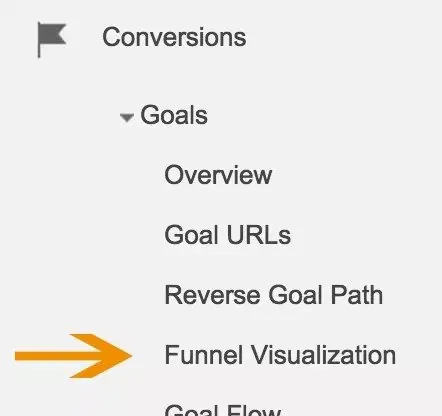
Here Google Analytics will visually show you what’s going on in your funnel. Focus on trying to understand why consumers are abandoning their carts at certain steps in the checkout process.
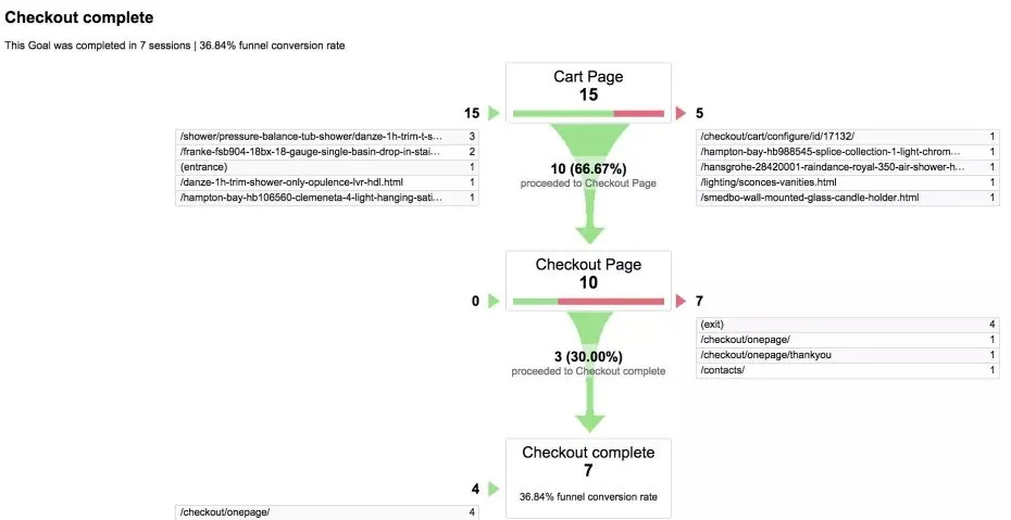
In this example, you can see that a third of customers who reach the cart page are dropping out. They are abandoning before they even see the checkout page. The exit column shows us that they’re going to other product pages, which implies they’re getting distracted. A good solution would be to create a less distracting version of the cart and test it against the current one.
#4. How to Fight Shopping Cart Abandonment
You’ll never be able to eliminate shopping cart abandonment completely, but you can design your eCommerce site in such a way to meaningfully reduce abandonment rates, which our many features help you with. The policies that you implement on your site will also have a significant impact, as you’ll soon find out in the practical examples part of this article.
#4.1 Increase Add To Cart Button Sizes
Sometimes, if things aren’t totally obvious to your shoppers, they may abandon a purchase. This is the case with your eCommerce site’s cart buttons. You may think that just having an “add to cart” button of any size or color would be sufficient, but studies have proven this assumption wrong.
Let’s have a look at a few more case studies and see how other stores have identified and fixed cart abandonment.
IKEA, the online retailer of ready-to-assemble furniture, kitchen appliances and home accessories, was able to significantly boost its online sales and thereby fight abandonment rates by, in part, improving how its Add to Cart buttons looked. After the company changed its cart buttons to be bigger, flashier and bolder, along with six other design tweaks, its online sales jumped through the roof.
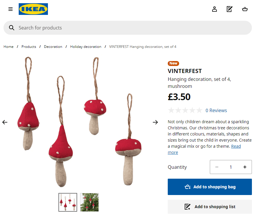
Changes to the way Add to Cart buttons look in general have also proven effective at increasing conversions. This involves not just the actual size, but other aspects like the color, placement and even type of text in buttons. There’s more about that in this study that goes into in-depth detail about elements of any good eCommerce page.
I highly recommend that you use tools like Optimizely to A/B test variations of your Add to Cart buttons to determine which works best.
#4.2 Get Rid of Any and All Distractions
What’s a distraction?
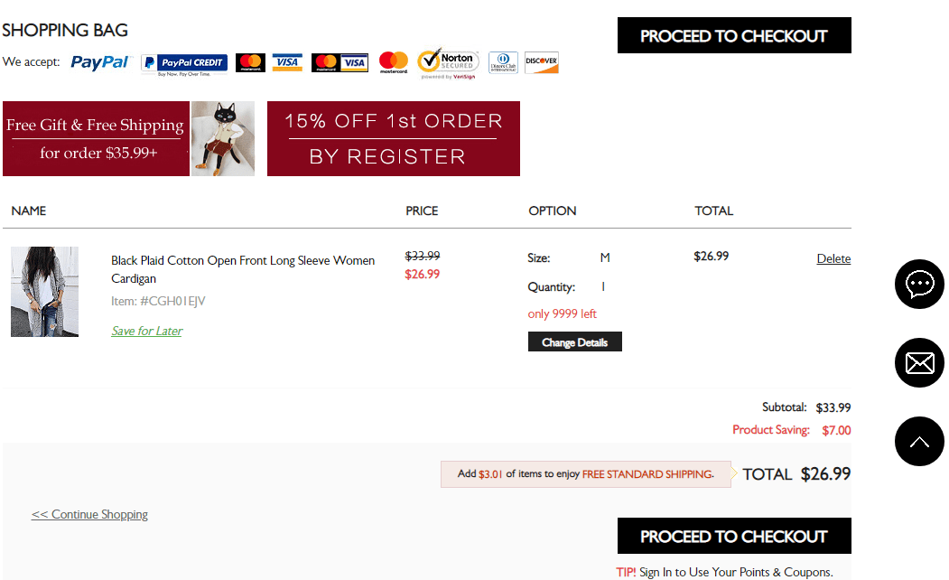
A distraction is, broadly speaking, anything that doesn’t contribute to nudging your shopper to committing to the final sale. This can be anything from calls to action that prompt shoppers to sign up for email newsletters and remind them to “like” your site on Facebook! A distraction should never be present on the most important page of all in the sales process, which are the Cart page.
In practical terms, the only things that you really should have on your checkout page are buttons like “Checkout Now” or something similar and “remove item.” A specific case study proves this principle perfectly.
#4.3 Pursue Those Who Seem to Initially “Abandon” Shopping Carts
An all too common misconception among those working in the eCommerce industry is that every shopper who abandons a cart…really has a hardcore intention not to purchase from your website. The truth is entirely different from this, and it’s worth taking a much deeper look at.
A substantial number of customers are actually just in so-called “browsing mode” when they added items to the cart and then later “abandoned” it.It’s highly important insight into consumer behavior to realize that lots of shoppers actually use their carts as wish lists. In other words, they put items into the cart, “abandon” the cart, and then really have plans to later on come back to the cart to complete their purchase.
A Forrester study into shopping behavior found that 42% of all online shoppers (the breakdown is 16% male and 26% female) initially “abandoned” their purchases since they had plans to come back later on to consider finishing their purchases.
So if you’re counting everyone who’s ever abandoned a purchase as a real case of shopping cart abandonment, you’re on the wrong track.
It stands to reason, then, that you still have a chance to turn some of those who abandoned their purchases into conversions. So how do you go about converting these potential customers?
Here are some options you should try:
- Try retargeting ads on certain customers based on product pages that they spent the longest time on, using tools like AdRoll or Perfect Audience
- Entice new customers with time-limited offers, such as discounts or free shipping (to get them over the indecisiveness of putting items in a cart for later consideration)
- Use scarcity and urgency psychological triggers to nudge them toward buying now rather than later.
- Send them emails if items in their wish list or “abandoned” cart go on sale
- Use persistent shopping carts that save your customer’s cart contents across various user sessions by using so-called persistent cookies
#4.4 Don’t Hit Your Customers With Unexpected Costs
Online shoppers just hate unexpected costs, and who can blame them? Unexpected costs imply a level of deception, even if it wasn’t intentional. At the end of the day, the only thing that should matter is whether or not your customers went through with a purchase.
According to data from Statista, the number one reason (56%) for shopping cart abandonment is when customers are faced with unexpected costs. This makes a ton of sense because people tend to get frustrated when additional charges are tacked onto what they’re already going to buy. In fact, the stats on this get even bleaker when you consider that up to 61% of all online shoppers are somewhat likely to abandon their entire purchase if you don’t offer them free shipping!
That’s right: Customers want you to sweeten the deal for them, so what do you do?
Listen to these surveys of online shoppers and give them what they want!
Give them free shipping, right off the bat. That way, you can nip the issue of unexpected costs in the bud since the first form of unexpected costs consumers will run into on a checkout page is shipping costs.If offering your customers free shipping doesn’t turn out to be viable for your company, then there are some alternatives that you can try in order to respect your customers’ aversion to unexpected costs:
- Offer customers free shipping during a specific day or week during the peak season (Christmas, for instance)
- Entice your customers to become members (think Amazon Prime), which entitles them to two-day, free shipping
- Offer customers free shipping if they spend a certain amount of money
#4.5 Don’t have Excessively Expensive Prices on Your eCommerce Site
One of the most popular reasons behind shopping cart abandonment is when a site’s prices are too high or customers locate better deals on another site. There’s always the temptation to do comparison shopping, and you are hurting yourself if you raise doubts in your own customers’ minds about whether or not they’re getting the very best deals on your site.
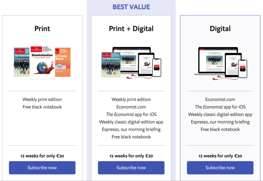
Check for instance the pricing page of the Economist’s latest offer. You can purchase Print edition at 20 euro, Digital edition at 20 euro and Print + Digital at..well 20 euro.
What’s the catch you may ask?
Well, it is simple. In fact, there aren’t 3 plans as you think of but only one: Print + Digital at 20 euro. The other ones are added as a decoy as slightly worse options to reinforce what great deal you make if you purchase the Best Value plan.
Interested in more pricing experiments you can benefit from and learn? Check this article.
Here’s what you can do to put your customers’ minds at ease.
You can offer your shoppers a price guarantee. Doing so is quick, easy and straightforward. It’ll definitely leave a good impression on your customers because their fears of finding better deals elsewhere will be efficiently allayed. Best Buy is absolutely the best example of this strategy, as the company’s famous for its low-price guarantee.
Using a loyalty program is another proven tactic to guard against excessively high prices. Your loyalty program should have the following features for it to work: free shipping and a points system for perks or additional discounts. In the eCommerce world, Amazon Prime is the best example of this approach.
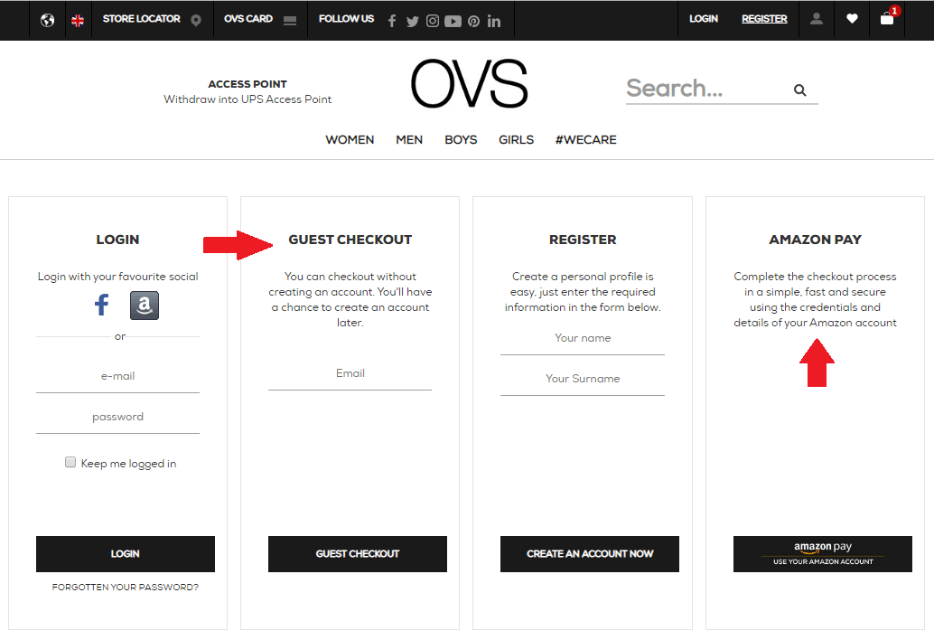
#4.6 Don’t force your customers to register
According to eConsultancy, 25% of shoppers abandon their purchases because they are forced to create an account. Your customers come to your website to buy things.
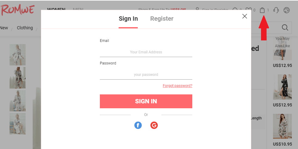
For instance, on clothing store Romwe if you want to checkout a popup with a registration screen appears when you want to check your cart. Yes they added social media registration but still there are frictions as new users that dont have an account will have to register before even seeing their cart, purchased products, fees etc.
Your customers don’t want to be forced to make up a password and create an account. They want instant gratification, not in-advance commitment to your brand. To ensure your checkout is conversion-friendly, you should always make account creation optional. As an alternative, you can invite them to create one after they’ve purchased.
#4.7 Gain the trust of your customers
Major causes for suspicion include website design flaws, outdated layouts, missing images, and no SSL certificate. Thankfully, there are many ways you can increase trust on your site. For example, use the likes of recognizable trust seals, customer testimonials and product reviews and endorsements.
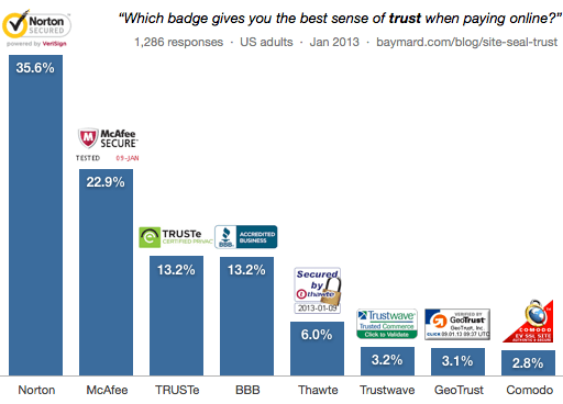
According to a survey done by Baymard.com, most of the users (of course excluding the techie geeks) don’t understand how an SSL certificate works or a payment it’s done through a secure channel. It’s therefore recommended that you add visual clues like site seals to increase the perceived security of the sensitive fields in the form in order to make your users feel more comfortable when handing over their credit card information.
According to the same survey, 35,6% of those 1286 users that answered said that Norton Secured give them the best sens of trust when paying online, followed by 22,9% who named McAfee and 13,2% who named TRUSTe (now TrustArc) and BBB – Better Business Bureau.
#5. Practical Case Studies
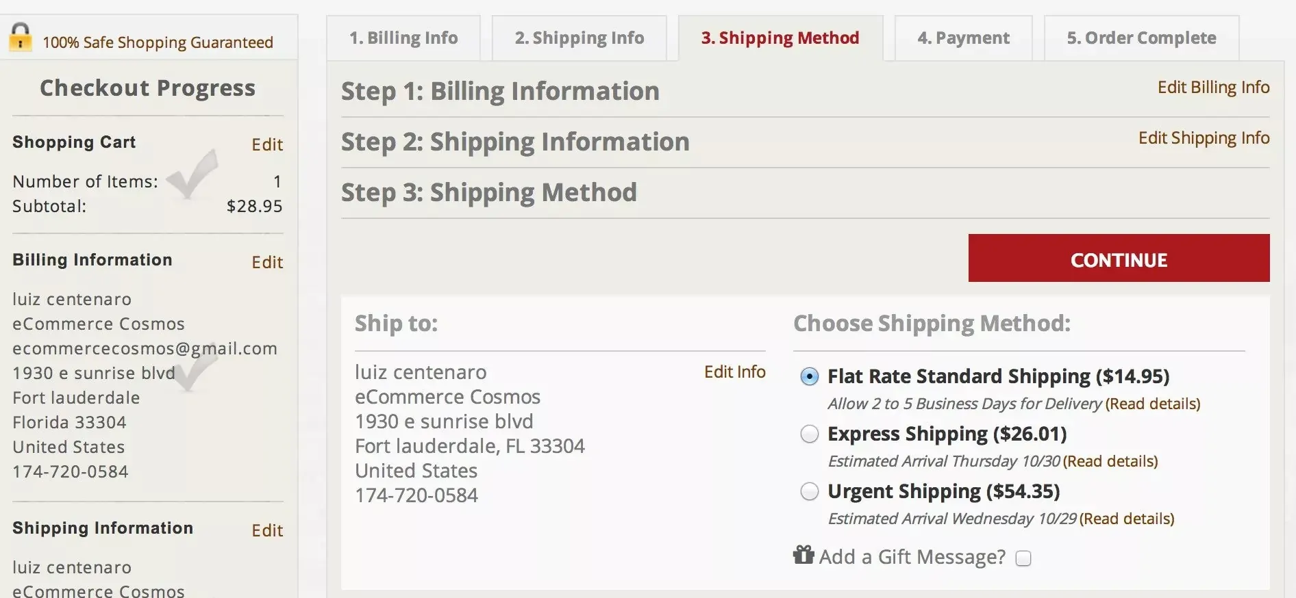
5.1 Customers from a region abandoned their carts 48% more than others
LaTienda, an online food retailer from Spain, wanted to understand if shipping costs were contributing to their cart abandonment. Remember, we’ve already seen that 56% of shoppers abandon their cart because of unexpected costs like extra shipping fees.
To track this, they created a funnel in Google Analytics and segmented visitors based on geographical region. A simple way to do this is by going to the ‘Location’ reports under ‘Audience’ in Google Analytics. This will show you how people from various locations convert in your funnel.
What LaTienda noticed was that customers from region B abandoned their carts 48% more than customers from region A. Interestingly, region A was closer to their warehouse, while region B was further away. This meant that, because of their distance-based shipping policy, customers from region B had higher costs and tended to abandon more often.
To combat this, LaTienda decided to test a flat rate shipping model. They immediately saw a conversion increase of 70%.
5.2 Increase your Conversion Rate by Removing Distractions
Another great example is a Swedish based online retailer of personalized gifts, NameOn.se. After setting up their cart abandonment funnel in Google Analytics they noticed a 31.7% drop off between the cart and checkout pages.

With a goal to increase conversions to the next step by 10%, they had some work to do. On analyzing their original cart page, they found they had 9 Call To Actions! These included social media buttons, email subscription buttons, and a whole bunch of other things that had nothing to do with buying the product.
Imagine if you were at a physical store, and you were about to buy a product when a store employee came up to you and asked you to like them on Facebook, subscribe to their newsletter, and tweet about them.
Unthinkable, right? Yet that’s exactly what many eCommerce stores do. This is a huge distraction for consumers moving into the final step of checkout.
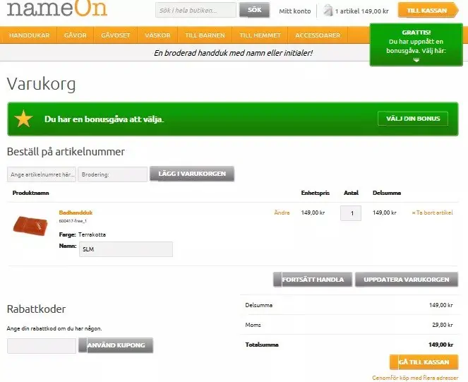
To solve the problem, NameOn creates a variation that eliminated all unnecessary CTAs and added a higher contrast Add To Cart Button.
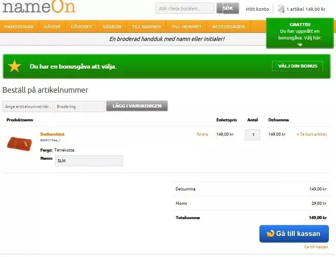
The results spoke for themselves with the clean variation showing an 11.40% increase in conversions over the original cart page. That seems like a small number, but it actually meant over $110,000 increase in yearly sales for NameOn.
#6. Track And Testing Your Checkout Before The Holidays
So it’s almost Black Friday, then you have Cyber Monday, Thanksgiving, The Jewish Holidays, Christmas, and the New Year! This is when all the shopping happens. If you haven’t got your cart abandonment issues under control, you’ll be missing out on a lot of money.
Start by setting up the tracking funnel in Google Analytics. This should take less than 5 minutes. Use the checklist for reference.
Then, identify why people are abandoning your cart and think of some ways to stop it. You’ll need to test them to determine the best possible solution.
#7. Takeaway: Reduce Abandonment, Increase Conversions
That’s the direct relationship right there: The more you reduce shopping cart abandonment on your site, the more you increase conversions and revenue. While you can’t stop abandonment completely, unfortunately, you can do a lot to reduce them in a meaningful way.Therefore, it’s in every eCommerce company’s power to make sure that abandonment rates stay low and shoppers are guided through every page until they make the final conversion of a purchase.
Doing so, however, takes a lot of focus on the various elements on your site. This extra effort is worth it, though, as you’ll be rewarded with more revenue, and who doesn’t want that?
 Monetize.info We Help You Monetize Better Your Digital Assets! 💰👍

![How To Track And Fight Shopping Cart Abandonment [Ultimate Guide]](https://monetize.info/wp-content/uploads/2019/11/How-To-Track-And-Fight-Shopping-Cart-Abandonment-Ultimate-Guide.webp)


![How to build backlinks for eCommerce [The Ultimate Guide]](https://monetize.info/wp-content/uploads/2020/07/How-to-build-backlinks-for-eCommerce-The-Ultimate-Guide-310x165.webp)


