Adaptive design has become the tool of choice to establish an eCommerce sales platform.
Learning to leverage this crucial tool in designing a UX-centric eCommerce website isn’t just a matter of best practice – it can spell the difference between productivity and profit.
So while it may seem that adaptive design requires more work as you need to create design layouts for at least six screen widths, responsive design can be more complex as improper use of media queries can make for display and performance issues.
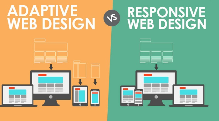
Table of Contents
Adaptive Web design vs Responsive Web design
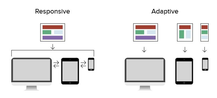
A quick note: Adaptive design uses static layouts (based on breakpoints) that don’t respond once they’re initially loaded.
This design method detects the screen size of the target device and loads the appropriate layout for it.
Here, you would normally design an adaptive site for six of the most common screen widths: 320, 480, 760, 960, 1200, and 1600.
This contrasts with responsive design, which is fluid and adapts to the size of the screen regardless of the target device. It uses CSS media queries (such as display type, width, height, etc.) to change styles based on the target device. Only one of the queries is needed for the store to adapt to different screens.
Why Use Responsive Design?
Because the bulk of this article will be dedicated to the benefits of using adaptive design in eCommerce, let’s touch on why others opt for responsive design.
An increasing number of new sites use this methodology because it’s easier for less experienced designers and developers due to the availability of themes on CMS platforms like WordPress, Joomla, and Drupal.
So, while a responsive design may not offer much control, it takes much less work to build and maintain and provides a more fluid feel.
But when it comes to eCommerce, where user experience is of the essence, there are several reasons why adaptive could be considered the smarter choice.
First off, responsive sites are vulnerable to slow loading speeds if it isn’t properly implemented. And while there might be a slew of readily available themes, responsive design requires more coding to ensure that the site fits each screen that tries to access it.
Additionally, because responsive design basically shuffles content around for it to fit the device window fluidly, you need to focus on the visual hierarchy of the design as it shifts around.
Why Use Adaptive?
In theory, the adaptive design ensures the best user experience regardless of device and screen size. As noted by the Interaction Design Foundation, unlike responsive design where a screen flows from, for example, desktop design to a tablet, adaptive offers tailor-made solutions – adapting to the user’s situational needs and capabilities.
Additionally, you can design to optimize ads for relevant user interfaces using adaptive design. So if you have a behavioural targeting system in place, you can design for more personalized, relevant ads, ultimately leading to a better user experience.
There’s a lot of discussion on the benefits of responsive vs adaptive design. Still, one of the undisputed benefits it provides is how it improves eCommerce sales while improving user experience. Here’s why that is.
Latest eCommerce Trends
Four important eCommerce statistics call for a stronger push towards adaptive design:
- Global eCommerce sales reached $3.46 trillion in 2019.
- 67% of customers use varying platforms and devices to conduct their online shopping.
- 9 in 10 shoppers say that good visuals and key interface design inform their purchase decisions.
- Around 30% of consumers return to a website they’ve purchased from before.
If you’re building a business website, you should keep these statistics in mind to create a unified user experience for your customers.
All data shows that the future of eCommerce will revolve around a multi-platform, UX-centric experience – and adaptive design is one of the most powerful tools that you can use.
Using Adaptive Design To Make A Website that Sells
Getting visitors to make a purchase has always been one of the biggest challenges of eCommerce businesses. Adaptive design can help close the gap between offers and sales in several ways:
#1. Using Adaptive Design For Different Platforms
A common lesson eCommerce for beginners often teaches is that you should always design a layout that responds to your customer’s device to browse your online storefront.
The issue here is that most of them cannot clarify the difference between “responsive” and “adaptive” layouts, which can cause suboptimal UX once users enter the site.
Admittedly, one reason most resources would fail to mention this is because the adaptive design is expensive. But since customer return and retention relies so much on a smooth UX experience, investing in the additional effort required for adaptive web pages can boost the conversion and sales of eCommerce sites.
#2. Using Adaptive Design To Deliver On Your Customer’s Delivery Expectations
Everyone likes flexibility when ordering online.
Gone are the days when you’re expected to go to the store to pick it up: now, with the variety of available fulfilment options, consumers expect an array of options when they buy something.
Adaptive design can help this by allowing sellers to give a more realistic (and therefore, reliable) expectation to their buyers about when they’ll get their product.
Adaptive design can also help with inventory management, especially when it’s en route or held at a fulfilment centre. An adaptive system can handle the capacity to assess delivery priority much better than a manual one. This is crucial for the workers that need always to be updated about the shipping status of items.
#3. Use Adaptive Design To Bridge Long Distance
Selling with eCommerce often runs into issues with distance, especially for stores that ship overseas. Aside from the time difference, there’s also the latency caused by delays in transferring data.
These delays might be minuscule, but they’re noticeable enough for your consumers to pick up on it. The worst-case scenario is that your consumer leaves your site because of these technical difficulties, or you end up losing your existing customers because of it.
Using adaptive methods like Content Delivery Networks (CDN) can help bridge this distance between you and your audience. Using the nearest servers to their local IP address, you can craft a much smoother UX experience for them by integrating it with an adaptive web page. Not only does this give you key demographic data you can use in future campaigns, but it also helps with product management.
#4. Use Adaptive Design To Reduce Visual Clutter And Server Demands
Unlike responsive layouts, you can build adaptive designs from the ground up – and that gives you plenty of flexibility on how to optimize a page for different data demands.
For example, you can create an adaptive web page that responds to whether the device uses data or Wi-Fi and cut out content as needed. This reduces the demands on your servers and provides great content for a better customer experience.
#5. Use Adaptive Design To Optimize Website Visuals
As one of the newer web design tools for designers, adaptive layouts solve a long-standing problem with visual elements: to keep their size ratio without reducing or compressing their quality.
This is crucial for smaller-view screens such as tablets and mobiles (which, remember, most eCommerce now operates from) since the screen can now display images well. This improves the customer’s UX experience, which gives them more confidence to buy the item they’re looking at.
#6. Use Adaptive Design To Interact With User Input In Real-Time
The activities of a customer aren’t limited to the pages they visit or the products they look at, but in how they move about and look at your website. You can catch and categorize this information as sensor data or how your audience physically perceives your digital space.
Adaptive design can give you more opportunities to leverage sensor data, allowing you to personalize a customer’s browsing experience with your eCommerce store. This gives you greater freedom to show them the products they’re most likely to buy.
#7. Use Adaptive Design To Improve Website Navigation
One key inclusion that adaptive design has over-responsive layouts is the ability to customize micro-interactions – those tiny changes that the user makes to a website according to their preference. Adaptive design can give your customers more agency in navigating your store to better get to the products they want, which can improve their overall UX experience with your site.
It also helps your website maintain a cohesive navigation flow between switching from different devices. Unlike responsive layouts that only shuffle the options for navigation, adaptive designs can streamline the entire process by using a different method. Of course, before you can even get there, you’ll need to think long and hard about eCommerce SEO services.
How Are Other Stores Leveraging Adaptive Design?
For the best examples of how these strategies are deployed by other websites, it’s helpful to look at the top brands that have leapt platforms and viewing devices:
Best Buy
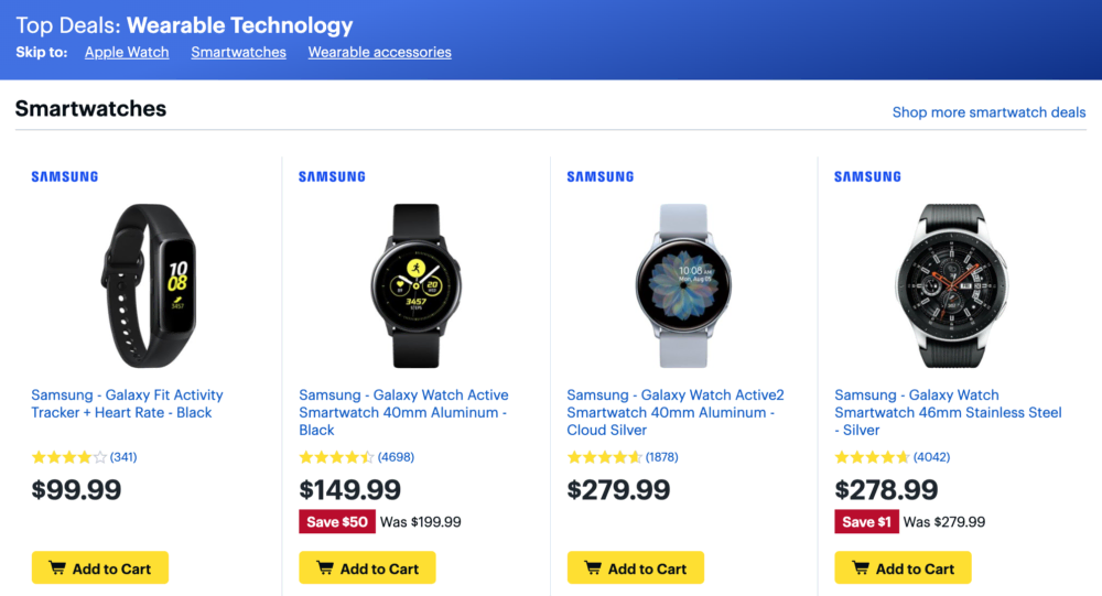
With all the supplies this brand offers, smooth navigation through all their stocks was an obvious choice. You can see that their mobile version doesn’t give as much information and focuses more on the versatility of their search bar. In contrast, their desktop version gives more leniency to categorizing their products.
Nike
As a visually-oriented brand, Nike’s focus on aesthetics balances out with the traditional needs of an eCommerce store. This results in a minimal presentation of both visuals and navigation elements in their mobile and desktop pages, with additional options to refine your search for easier viewing on small devices.
Air France
Booking flights can often be a very stressful endeavour, so the mobile version of Air France displays only the essentials you need for air travel. While other pertinent sections such as travel guides and trip advisories are still accessible via mobile, they’re displayed more prominently on the desktop page for easier visibility.
Booking.com
Leveraging the geographical advantage that mobiles have over desktops, Booking.com adapted its mobile homepage to feature their “search nearby function”.
This allows their mobile customers to cut through to reach the heart of the service, which is the usual reason the site is on mobile, to begin with.
More mobile eCommerce sites will continue to switch to adaptive design, so it falls on eCommerce merchants to keep up with the trend. Most eCommerce metrics will take adaptive design into account – if not a measure of success, at least a measure of profit.
Using Adaptive Design To Your Advantage
Adaptive design isn’t the only way that eCommerce websites can increase conversion rates and promote brand engagement. But it’s a tried-and-tested way of ensuring that every visit to your online store is smooth, no matter where they’re browsing from. Look at how to write the right website design RFP here.
And if they find shopping with you a delightful experience, that means they’re more likely to return – and your business can grow from that base alone.
 Monetize.info We Help You Monetize Better Your Digital Assets! 💰👍


![How to build backlinks for eCommerce [The Ultimate Guide]](https://monetize.info/wp-content/uploads/2020/07/How-to-build-backlinks-for-eCommerce-The-Ultimate-Guide-310x165.webp)
